A Genius' Sketches & Studies- Leonardo Da Vinci


"What the mind of man can conceive and believe, it can achieve" -Napoleon Hill.

"Leonardo di ser Piero da Vinci , April 15, 1452 – May 2, 1519) was an Italian polymath, scientist, mathematician, engineer, inventor,anatomist, painter, sculptor, architect, botanist, musician and writer" -via Wikipedia.com.

Read more...

MUJI Simply Simplicity + Block Tee Rants


Looking at these sketches makes me feel like drawing! But I don't have the time for such self-engrossing activities these days =(

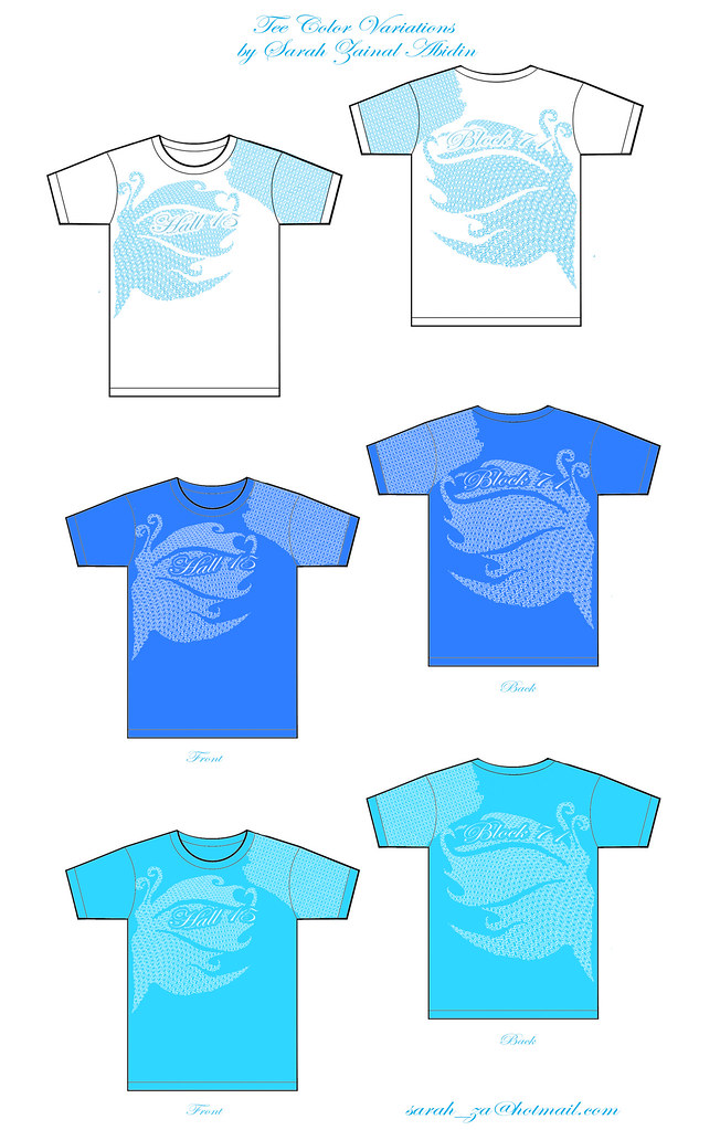
Anyway i had to redesign my block's t-shirt cos it turns out looking like crap after they printed it out on a dryfit shirt.

Looks so wrong in so many ways~!

Not only was the base colour a hideous shade of boring dark blue which doesn't go well with white print, the image was printed tooooo huge and details look like errors on a real life- scale.

And for once i felt the drawbacks of being a designer in this kind of simulated client-designer situation. And could really relate to videos such as this hilarious youtube one and also this cute one.

Don't let the cute-looking robot characters fool you in the first vid, it's peppered with vulgarities =) *smiles*

Came up with a new design within the same night since the deadline was the next day.

Followed a superhero theme... here's part of it:


Hand drew the 'superhero', scanned it in and cleaned up the lines. Kinda covered by the 'seventy-one' words but there's 'HALL' vertically down the superhero's costume. Here's holding up a '15' and the abstract black shapes behind were meant to be '71' for my block number.

I hope it turns out fine... well it better be since it's the final submission and they'll be printing it out in bulk already =x

I'm kinda pissed that it has to be so last minute cos i didn't get to put in my best effort and it was kind of a mish-mash-here-you-go sorta thing.

* Despite how annoyed I sound, don't get the wrong idea. I still do love designing and working on works of art and would even do it for free (which i do) for the right people and reasons. It is something i enjoy doing and these are the kind challenges i welcome to push myself. Gaining experience is important to me and i can see myself learning from all these and it'll constantly improve my skills =) *

Read more...

Butterfly T-Shirt Design for Hall 15

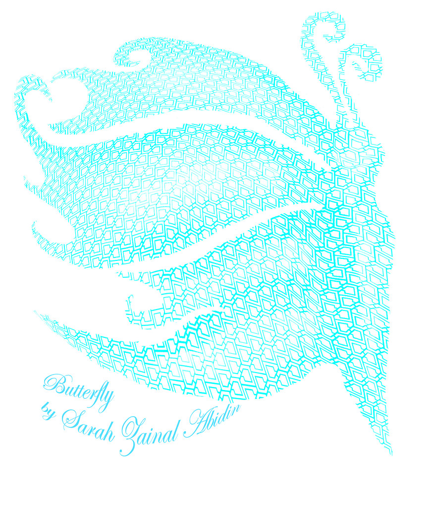
Above: More detailed 3D rendition of the 'butterfly' from the T-shirt design.


I painstakingly created the C-shaped lattices following the Hall 15 block structure to create a block of interlinked chains signifying a close-knit community of the residents.

The butterfly plays around the notion of being sociable, friendly, outgoing i.e. experimenting with the metaphor 'social butterfly'.

I'm not sure if the design will be finalized or I'd still have to make changes according to the block representative's opinions- like the colors, meaning , etc.

However several self-taught skills were attained while doing this such as learning how to use Adobe Illustrator (like finally~ took me forever to get the basics).

A superb tutorial for beginners in Adobe Illustrator is from Illustration Dan's Youtube Channel.

Through many experimentations of different techniques, I also discovered how warping latices together with the burn and dodge tool could give images a more 3D effect.

The reason i took up this challenge is because...

I'd love to see my design on a tee and see many people wearing it around Hall =)

That'll give me a great amount of satisfaction.

Read more...

Vintage Toy Patents

I find these vintage toy patent illustrations particularly charming (circa 1920s to 1950s).


More from Patent Room.


The cursive elegant handwriting, beautiful line work, shading, details and neat handwritten labeling makes these works look like an art piece in themselves.

Their lines are imperfect as compared to the capabilities of today's applications such as Adobe Illustrator in making line works which gives these drawings such an appeal.

With every design so clean and perfectly sleek today, there is a loss in a sense of personal touch.

Most artworks are digitalized and cold these days and I am guilty of it too.

I think it'll take good skills to revert to this kind of vintage illustrative look using the good ol' hand drawing tools.

However, I'm guessing that one way to make a vectored line look less perfect is by printing it out, photocopying it (probably low res and higher/lower contrast setting) and scanning it back into the com again to get the noise and grainy bits.

Or you could just slowly photoshop it to look as such which I haven't thought of a way of doing it.

These drawings seems to have a hand-drawn kind of personal touch. I love their off-white discolored background too.

Discovered them while trying to get inspiration for my 'robot'.

I'm using my marionette book to create a kind of interactive installation piece but the idea is still vague.

Will have to head down to Sim Lim Towers to search for gadgets and get more ideas.

Gotta make it work.

Read more...

Cristiano Siqueira- Vector Art


Entirely in vectors... so amazing how smooth the blending of light and shadows are.

Elegant.

Read more...

Adrian Van Delzel- Inspiring Coloring Technique


Mix of gradation of colors and vectors makes it look unique. And the colours look 'flowy' instead of blocky which is always the case when vectors are used.

Read more...

Kandinsky Painting In Processing Application

Painting by Kandinsky.

And I'm supposed to use codes in Processing application to make up a section of this painting (free download of the application at http://www.processing.org/download if you're interested in checking it out).

Basically it requires some knowledge of graphs from Elementary Maths like the x and y coordinates to draw lines and shapes. Also has codes for filling in of colors, animating objects, etc...

So challenging yet I love it since I'm learning something totally new to me... this is the start to PROGRAMMING!

Something I'd only learn in school.. which is the reason why i chose Interactive Media over other majors like Photography and VisCom - which could be pretty much self-taught to a certain extent.

Read more...

Juicebox Camera!


These's must be the most adorable camera designs ever!

The idea is that people'll never know that you're holding a camera cos it looks just like a pack of fruitjuice. So awesome.

SGD68 each... Which is alright for something so cute i guess.

And you can supplement its use with a Solaris Film of ISO400 and above which will result in pictures with a different color tone.

However, my favourite Solaris gallery is from ISO100, for example, this gallery... which looks just like polaroids shots.


All the stuff are from Cat Socrates Shop. Though I can't be sure of how to order via online it since it looks like a relatively new website and even its 'About' section is not updated yet.

It's physical shop is at:

ADDRESS

#03-39b Bras Basah Complex

231 Bain Street

Singapore 180231


SHOP OPEN HOURS

12:00 pm - 8:00 pm daily

Read more...

Interactive Media Homework + Sch


I've got a new blog to share stuff stuff that are inspiring which is part of my Interactive Media Workshop I homework. Link.

We were supposed to upload 2 entries per week to share stuff related to the subject.

So this particular tumblr blog of mine is more towards digital, high-techy stuff.

Maybe I'll upload robotic stuff for my other subject, Anthropomorphism & Behaviors in Machines there as well.

Interesting module which I'll have to create a 'robot' for grading.

Hardly any limitations set by the teacher so... I'll need to search and decide on a particular interest to base my robot on.

School's been slack so far, not much important assignments since we are still in the intro stage.

As for Game's Design Workshop, it is fun since we get to play Wii in the 2nd lesson though i wished the pace would be faster. Less theory more hands-on practice!

And we also have to come up with our own ideas for a platform game.

I'm taking up Marketing as an elective again~ seems easy enough since I've done it before.

Now I'll leave you with a non-naturalistic 'Priest King' sculpture from Asian Art History.

'Priest King' sculpture, Indus Valley Civilisation, Mohenjo-Daro, ca. 2500BC.
Image stolen without permission but duly credited from here.

How do you tell he is of royal importance?
  1. his trefoil robe- royalty wear
  2. headband- royal accessory
  3. downcast eyes- reflective, noble state
  4. armband- royal accessory
*I wished the lecture would be more interesting*

Read more...

Heart Shaped Bokeh

Heart Shaped Bokeh
Heart Bokeh, originally uploaded by Arty Bug.

The hearts in the pic is a photography trick. *Winks!*

Not photoshopped!

Anyway it's a picture of the Singapore Flyer and all the light sources are turned into hearts.

Can only be done with a SLR/DSLR camera using a lens with high depth of field.

How to do it?

Firstly check this out and then thank me for sharing. Lol! Cos I'm simply thankful to my lovely friend who shared this with me.

And i dedicated the best, most romantic-looking heart-shaped bokeh to her for mentioning to me about this technique (although I had to do some research myself to find out how it's done).

It's some funky effect that you'll just love.

Read more...

Translate

Google-Translate-Chinese (Simplified) BETA Google-Translate-English to French Google-Translate-English to German Google-Translate-English to Italian Google-Translate-English to Japanese BETA Google-Translate-English to Korean BETA Google-Translate-English to Russian BETA Google-Translate-English to Spanish