Butterfly T-Shirt Design for Hall 15

Above: More detailed 3D rendition of the 'butterfly' from the T-shirt design.


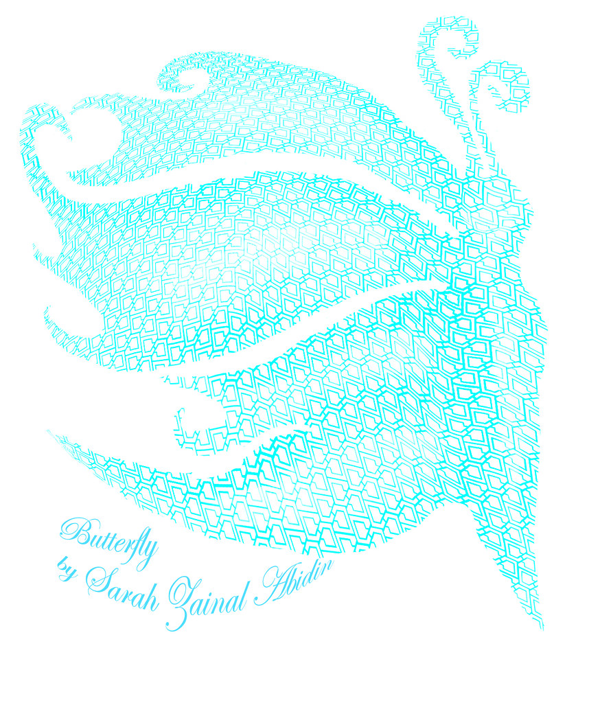
I painstakingly created the C-shaped lattices following the Hall 15 block structure to create a block of interlinked chains signifying a close-knit community of the residents.

The butterfly plays around the notion of being sociable, friendly, outgoing i.e. experimenting with the metaphor 'social butterfly'.

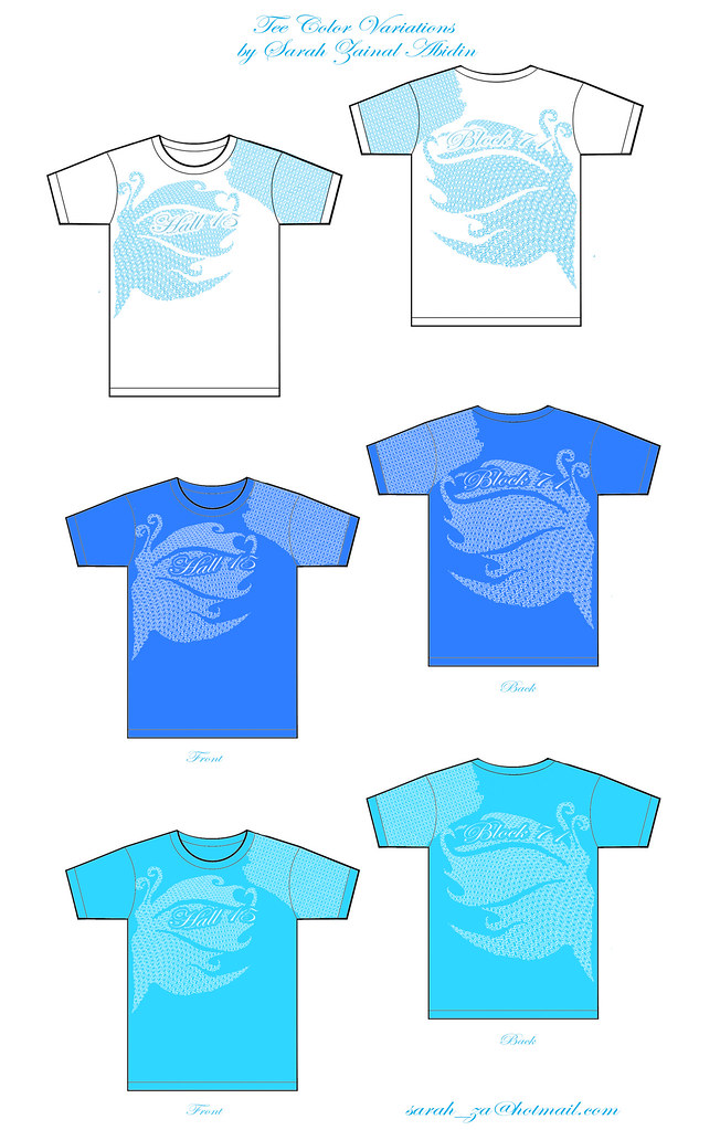
I'm not sure if the design will be finalized or I'd still have to make changes according to the block representative's opinions- like the colors, meaning , etc.

However several self-taught skills were attained while doing this such as learning how to use Adobe Illustrator (like finally~ took me forever to get the basics).

A superb tutorial for beginners in Adobe Illustrator is from Illustration Dan's Youtube Channel.

Through many experimentations of different techniques, I also discovered how warping latices together with the burn and dodge tool could give images a more 3D effect.

The reason i took up this challenge is because...

I'd love to see my design on a tee and see many people wearing it around Hall =)

That'll give me a great amount of satisfaction.

Read more...

Vintage Toy Patents

I find these vintage toy patent illustrations particularly charming (circa 1920s to 1950s).


More from Patent Room.


The cursive elegant handwriting, beautiful line work, shading, details and neat handwritten labeling makes these works look like an art piece in themselves.

Their lines are imperfect as compared to the capabilities of today's applications such as Adobe Illustrator in making line works which gives these drawings such an appeal.

With every design so clean and perfectly sleek today, there is a loss in a sense of personal touch.

Most artworks are digitalized and cold these days and I am guilty of it too.

I think it'll take good skills to revert to this kind of vintage illustrative look using the good ol' hand drawing tools.

However, I'm guessing that one way to make a vectored line look less perfect is by printing it out, photocopying it (probably low res and higher/lower contrast setting) and scanning it back into the com again to get the noise and grainy bits.

Or you could just slowly photoshop it to look as such which I haven't thought of a way of doing it.

These drawings seems to have a hand-drawn kind of personal touch. I love their off-white discolored background too.

Discovered them while trying to get inspiration for my 'robot'.

I'm using my marionette book to create a kind of interactive installation piece but the idea is still vague.

Will have to head down to Sim Lim Towers to search for gadgets and get more ideas.

Gotta make it work.

Read more...

Cristiano Siqueira- Vector Art


Entirely in vectors... so amazing how smooth the blending of light and shadows are.

Elegant.

Read more...

Adrian Van Delzel- Inspiring Coloring Technique


Mix of gradation of colors and vectors makes it look unique. And the colours look 'flowy' instead of blocky which is always the case when vectors are used.

Read more...

Translate

Google-Translate-Chinese (Simplified) BETA Google-Translate-English to French Google-Translate-English to German Google-Translate-English to Italian Google-Translate-English to Japanese BETA Google-Translate-English to Korean BETA Google-Translate-English to Russian BETA Google-Translate-English to Spanish